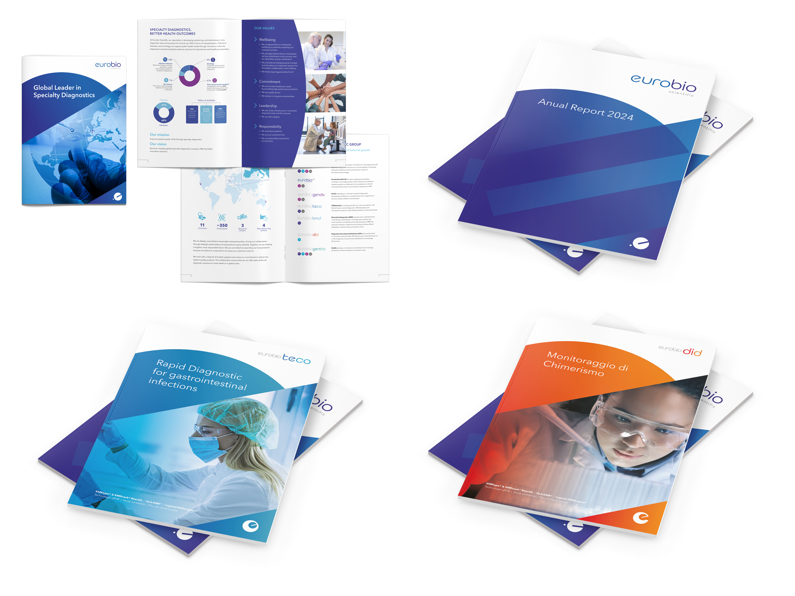
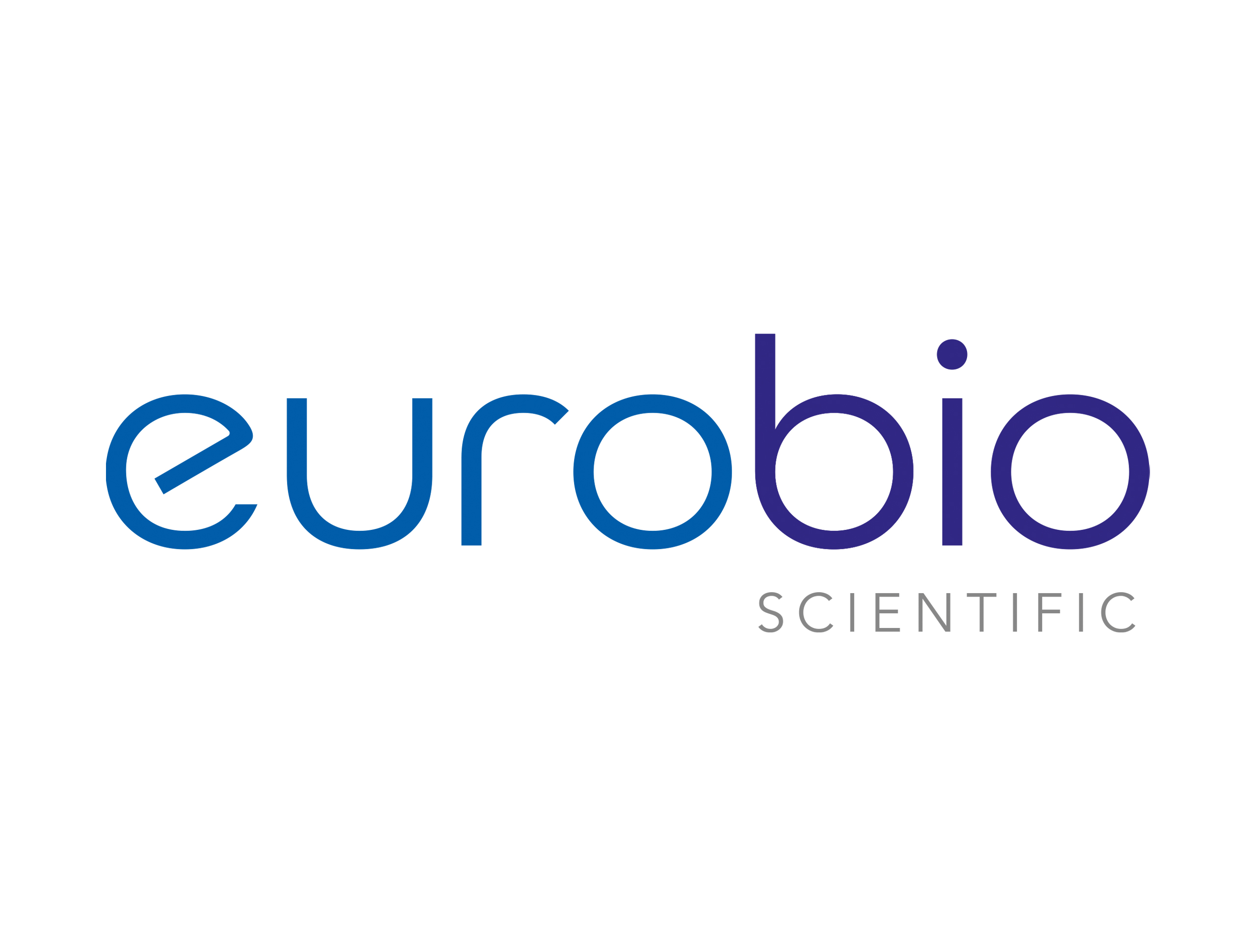
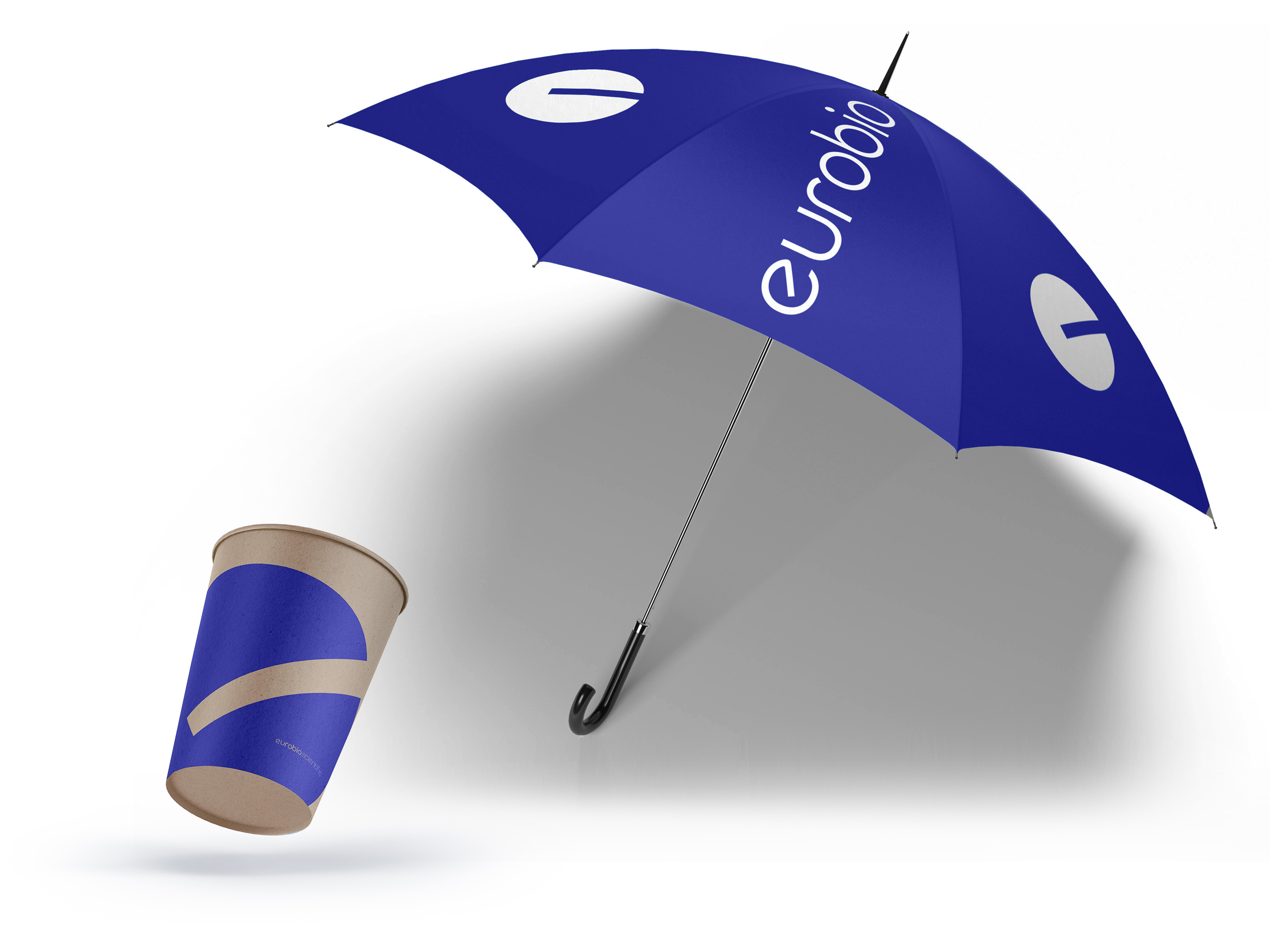
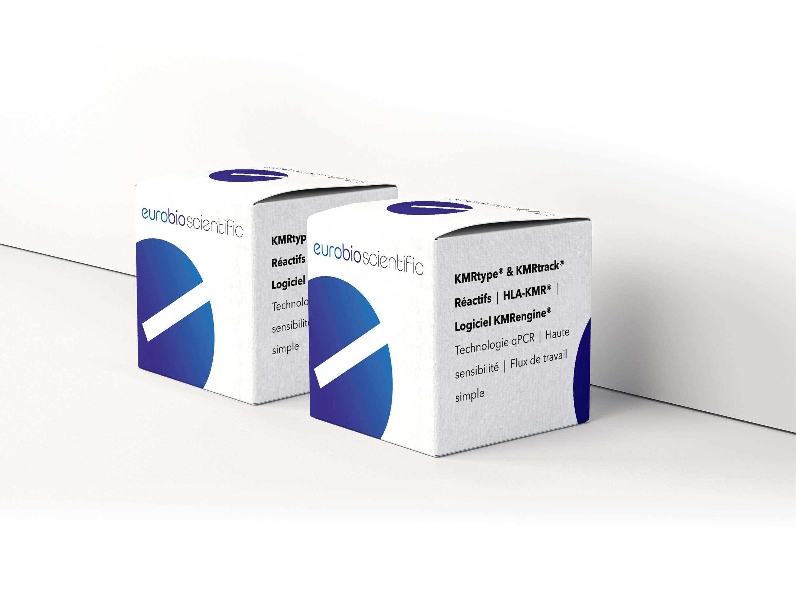
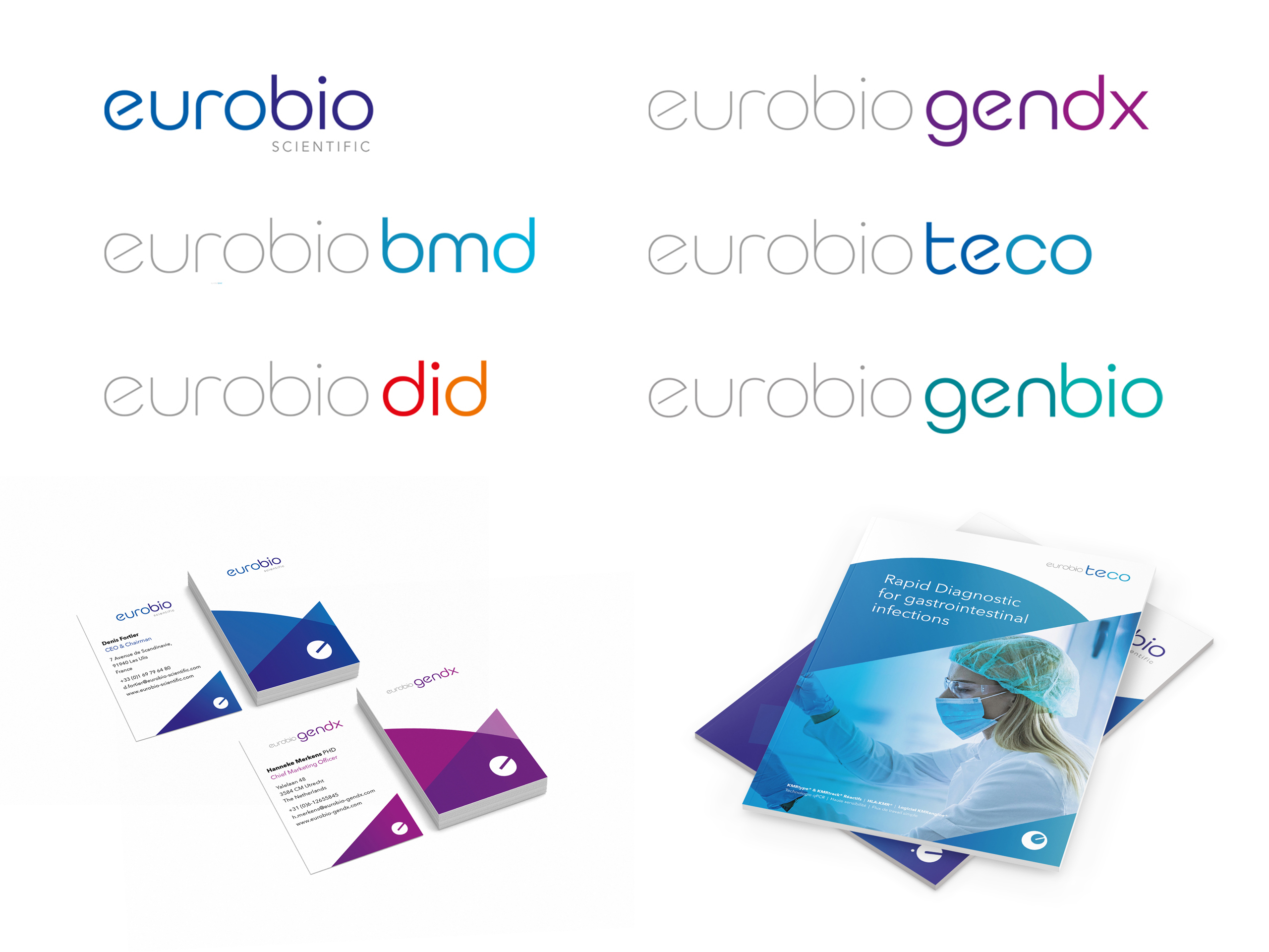
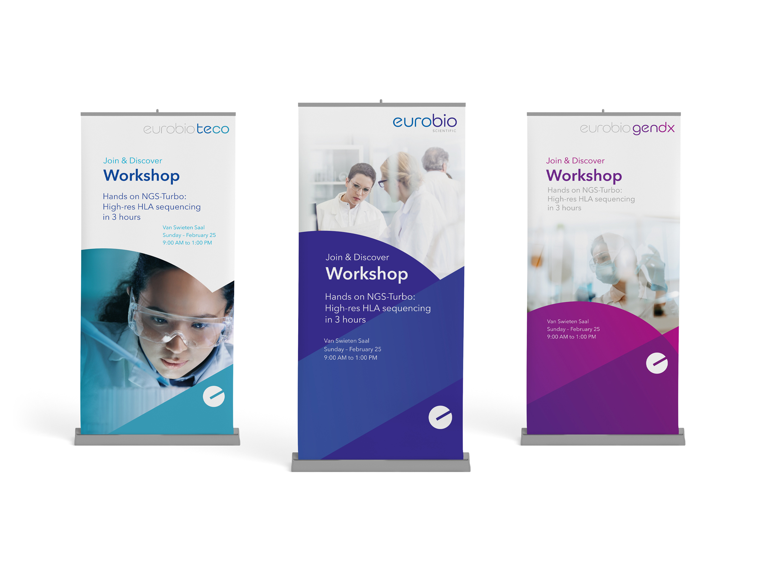
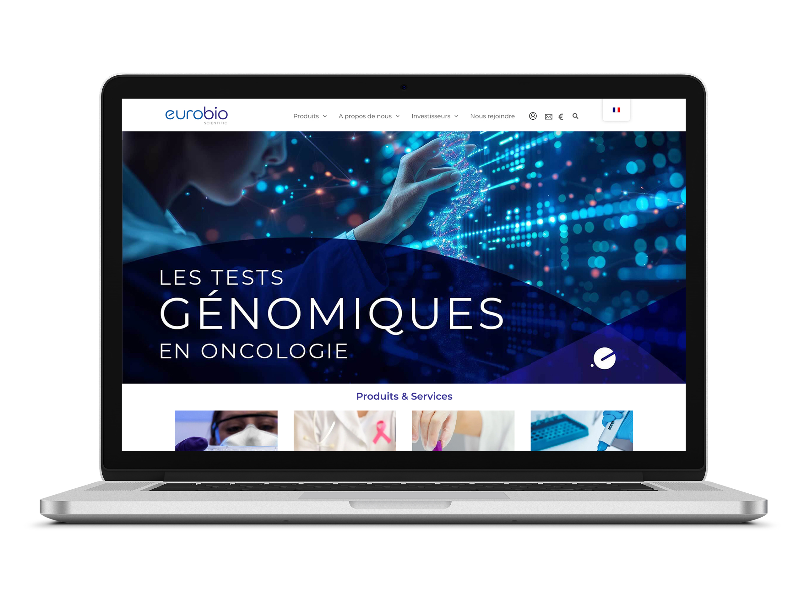
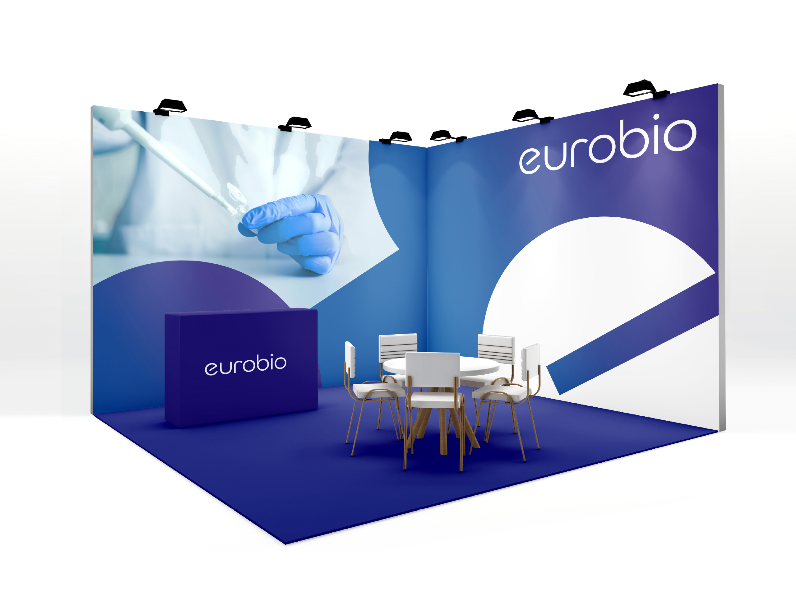
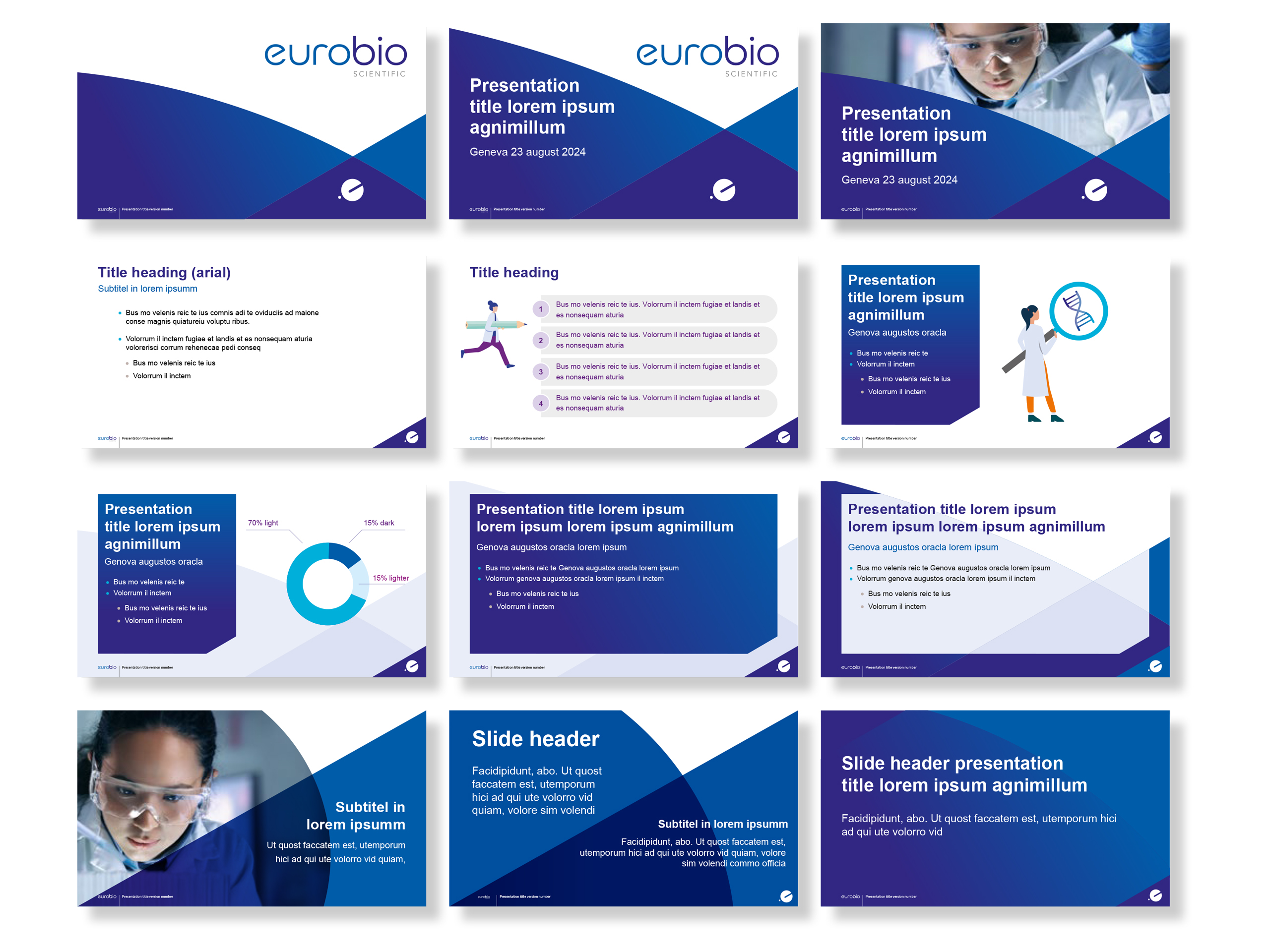
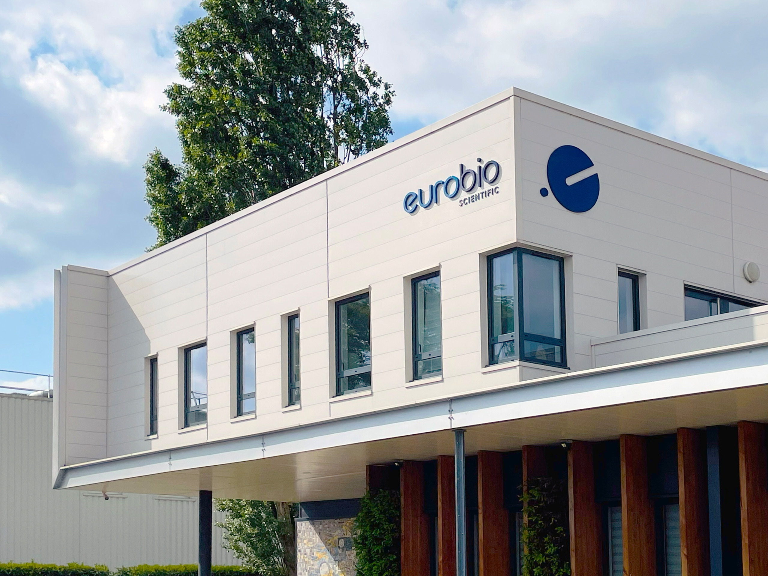
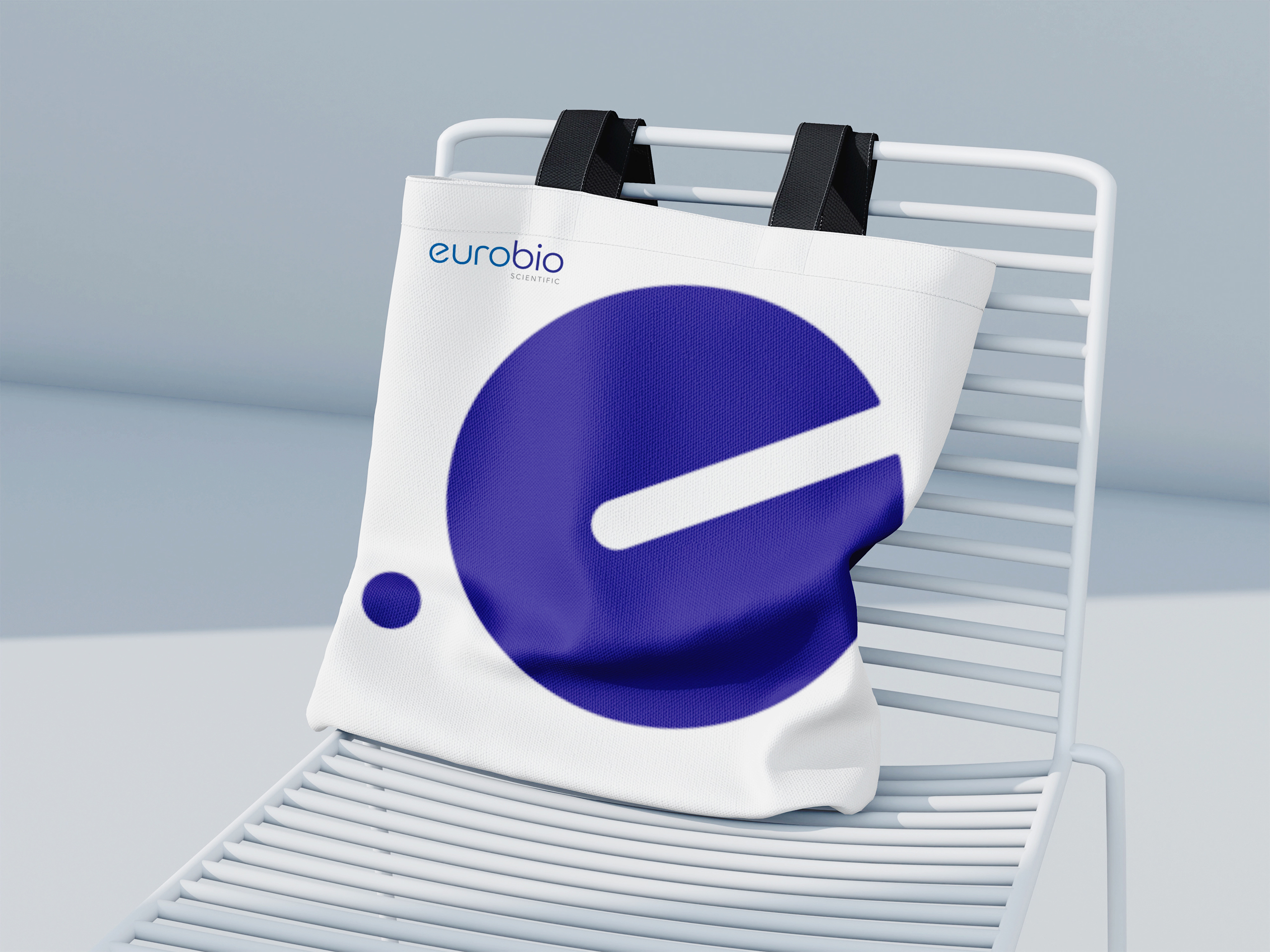
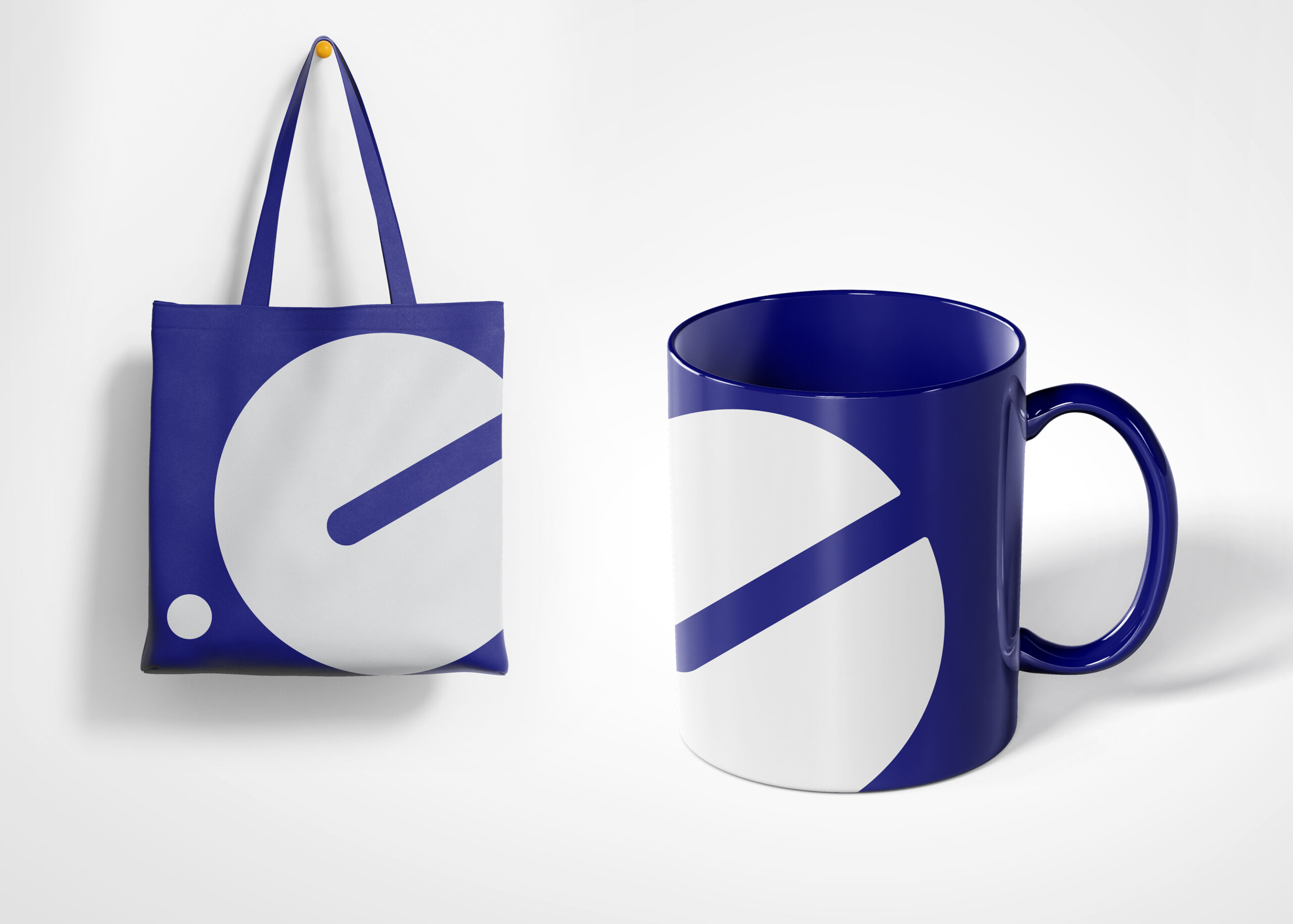
Eurobio has a new visual identity designed by WAT designers, consistently applied across all business units of the Eurobio group. The typography of the logo has been adapted with various letter modifications to give it a distinctive character. The word Eurobio appears in all the logos of the group’s affiliates, establishing a strong presence. The font and design elements are standardised throughout the group to ensure visual uniformity. A recognisable group icon has been introduced, and each subsidiary maintains a unique colour within the same design framework.
The primary colour of the Eurobio Group is blue. For other divisions, related colour palettes have been developed to give these divisions their own identities. These palettes reflect the colours previously used by the companies; for example, GenDx’s corporate identity was purple, while divisions such as DID, TECO, GenBio, and BMD each have their own shades within the family.
The branding communicates growth, innovation, and a unified vision. Eurobio aims to position itself as a leading international company in specialised diagnostics.